
TRON & TRON LEGACY:
THE COMPUTER GRAPHICS DIFFERENCES BETWEEN THE TWO
THE COMPUTER GRAPHICS DIFFERENCES BETWEEN THE TWO
One of my favorite remakes that I felt the story did the main plot justice is the movie TRON. Even though it is in a way a continuation of the story where the main character of the new movie is the son of the main character in the first movie.
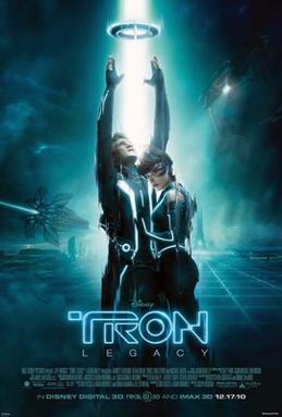
Original movie TRON (posted left) New release movie (posted right)
Some of the first impression of colors uses was very futuristic and cyber like technology that was able to attract the attention of something new and advanced where an adventure would take place inside a computer. Then the biggest differences between the two is the advancement in computer editing and computer graphics imaging.
- On the older poster, the colors were a broad spectrum of a rock star era where music video's were a big hit with lots of visual color effects. This tends to use the silhouette super-imposed with highlighting background light that shows our heros in a glorious and incredible glowing light. This shows a new form of presence and abilities that would send the viewers imagination soaring in its own story plot-line. In doing so, I see how I can be able to see how the entire story plot is built up to this moment in the poster.
- On the newer poster, a mist-like world of technological advances were the entire picture is a technological mystery where a bright beam of light is beginning to engulf our heros. Background shows many things as well to describe the event happening. The worlds ground in the poster is showing what the computer world is built on. Where the movie termed it as "The Grid". It is also showing a few chapter story plots in the background as well, such as the light train and the digital city. It is also pointing out the hero characters in their futuristic light suits in a world that is filled with light and darkness.
As you can see, a lot of similar things are present between the two posters. The TRON logo is positioned in the same area along with the similar hero position and posing. The logo on the two have changed quite a bit where the new one is presented in a neon soft glowing outline and the original is a metallic, digitally etched in bold steel like feel with a shadow effect. Of coarse the main pice is the disc that each hero is releasing into the light are identical as well.
Some alterations were made to the re-make to appeal to todays trends of culture, such as how the female is posed differently than the original, and the background is revealing much more of the story than the original poster does as well.
Movie previews have turned out to be quite different as well such as the new version of viewing for the re-make, 3D. Original bottom upper-right, re-make bottom left.
Works cited:
http://moviesblog.mtv.com/2010/10/20/tron-legacy-poster/
http://planetphotoshop.com/tron-graphic-effect.html
Works cited:
http://moviesblog.mtv.com/2010/10/20/tron-legacy-poster/
http://planetphotoshop.com/tron-graphic-effect.html
HUM 101 Roy Forrest
Loved them both, great movies. Excellent comparison. Haven't done one yet, but, was thinking of the Halloween or Friday the 13th posters.
ReplyDelete